As designers, we build prototypes for a lot of different purposes: Running user tests, presenting realistic plans to stakeholders, communicating intent to developers, the list goes on.
Because prototypes are so important across the design process, the experience of making them needs to be fast and easy. To help streamline and speed up your prototype creation workflow, I collected a few of my favorite tips and tricks for you. Read on!
1. Use master components to speed up prototype connections
Let’s say you’re designing a screen with some sort of persistent navigation, like a tab bar. You have to link each menu item to a specific frame (like linking the ‘home’ button back to the home frame). If that menu is repeated across multiple screens, as tab bars often are, the tedious task of linking can take way longer than it should.
THERE’S A BETTER WAY. Early in your process, turn your hamburger menu into a component. Once you’ve done that, link each menu item of that master component to the appropriate frame. Moving forward, any time you create an instance of the hamburger component, all the connections will automatically propagate! No more beating your head against a wall with busy work.
One caveat: This doesn’t work if you’re dragging an instance of a component from a team library. Because the master component is located in a different file than yours, out of the gate, you won’t be be able to leverage the previously mentioned tip.
Instead, create a new master component with the instance from your library inside it. Figma allows you to deep select down into the nested layers within each component, so you can still link multiple menu items from the instance without it detaching from the master. I often place some of these repeated components off to the side, outside my mockups, as a convenient place to access them and maintain the linked connections to different screens.
2. Use components for scrolling content
When you’re designing longer scrolling screens with fixed elements, such as status bars, headers or footers, you can simply drag the bottom of the frame down to accommodate the extra content. If the content exceeds the height of the viewport for the device you selected, Figma will automatically scroll the frame when in prototype mode. Handy, right?
But there are times when you want to see what’s visible in the viewport by default (i.e. before the user scrolls). That gives you a sense of what content is initially cut off when users first navigate to that prototype frame. Devices with different viewport sizes will segment the content in different places. To make it easy to peruse these different views, use a component.
To see what content is initially visible in a scrollable frame:
1) Turn your scrolling content into a component.2) Make sure you’ve set up constraints for all of the elements inside.3) Ensure “clip content” is checked in the properties panel (this should be enabled by default).4) Flip to prototyping mode and enable the scrolling direction you want by configuring the “Overflow Behavior.”5) Place an instance of this component within your designs and resize them to fit.
Now you can get an idea of what is in view for each device size and manage all of your scrolling content centrally with a single component.
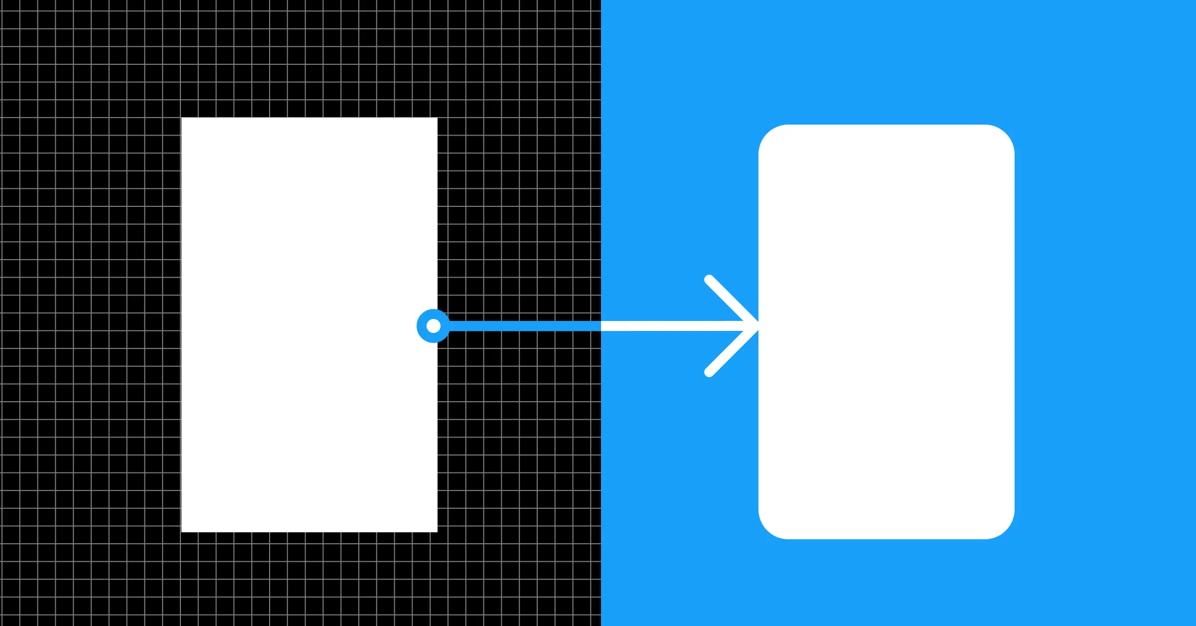
3. Timed delays and overlays to simulate interactions
With prototypes, instant interactions can feel abrupt for the end user. You may want to add elements of realism, like simulating loading screens or adding a short delay.
One light-touch way you can use to do this is through the after delay trigger, where an interaction takes place after a set duration. Timed delays are especially useful when paired with overlays, as you can see in the simple form example below.
Users expect the form to take them to a confirmation page, but if that happens too abruptly they may feel disoriented. By using overlays, with manual positioning and the swap overlay feature, we can create a simple button interaction in tandem with timed delays. The user then experiences a submit interaction, brief loading sequence and success message before the confirmation page appears.
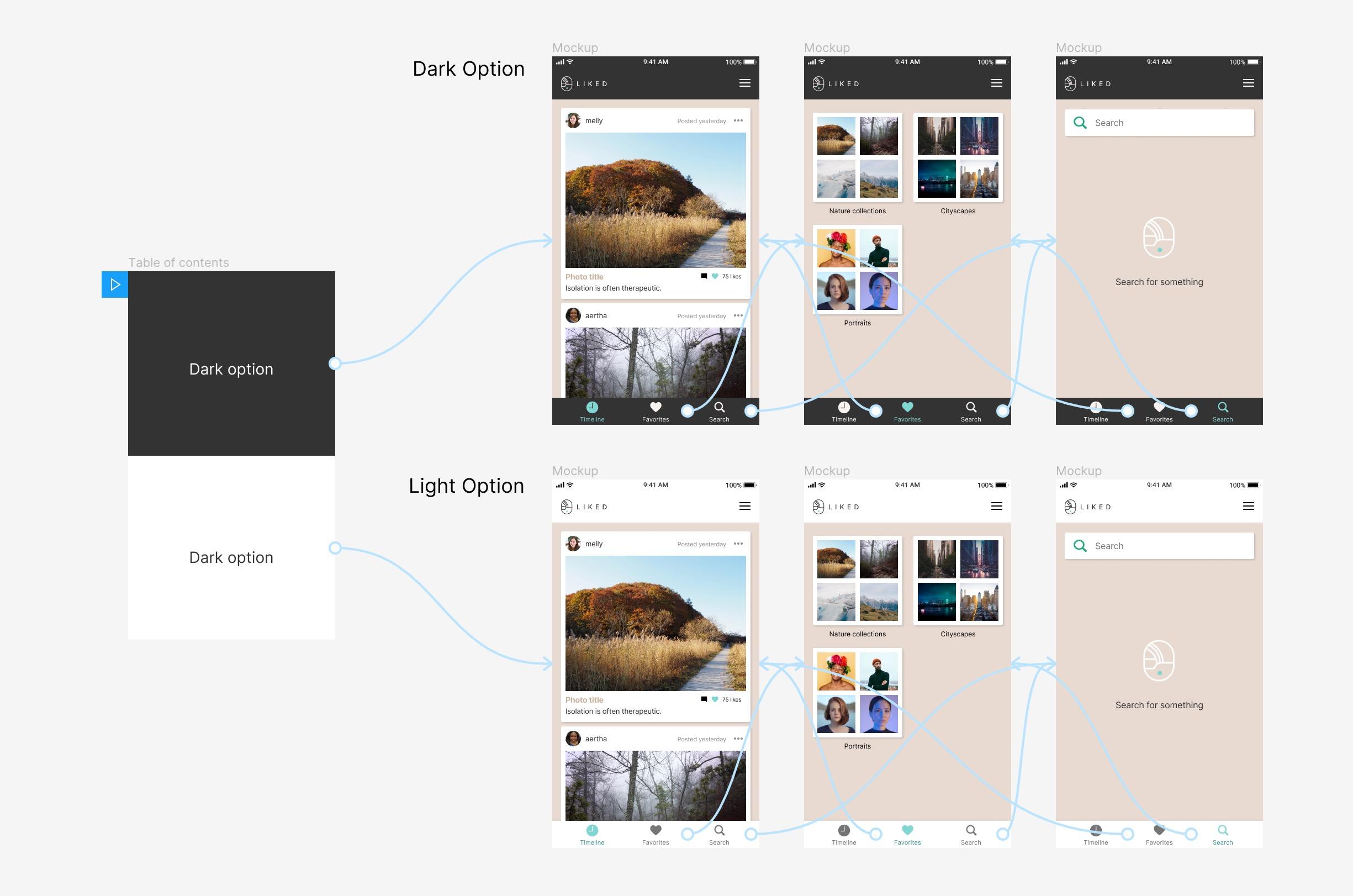
4. A table of contents
Prototypes in Figma are currently limited to single pages. This allows you to have separate prototypes in a single document, all with their own unique URLs that you can share with people when they want to view them. But sometimes, you just want to share one link to people that lets them see multiple design options.
To do this in Figma, create a table of contents frame as your prototype starting screen. Then, link each list item in the TOC to a different user flow. From the back-end Figma will interpret all of this as one prototype, but end users will experience them as different prototypes with a selection between them at the start. Note: All your user flows must be on the same page for this to work.
5. Using Observation Mode
Do you know about Observation Mode in Figma? It lets you follow along with another person’s screen while they present something or riff. You can click your collaborator’s avatar in the top right corner of the editor to see everything they’re seeing in a design file.
Observation Mode ALSO works with prototypes. You can click your collaborator’s avatar to know where they are in the prototype and what they’re doing. This is great for remote user tests when you want to study how a user is interacting with your design. It’s also a great way to get everyone to follow along when presenting your work in a meeting.
Source: https://www.figma.com/best-practices/five-ways-to-improve-your-prototyping-workflow/